
Student Project
|
Branding & Motion
|
9 Weeks
|
2026
Student Project
|
|
Branding & Motion
9 Weeks
2026
NOTHING TO SCREAM ABOUT
Dead Air is a conceptual late-night comedy-horror channel made for people who know the genre a little too well- the jump scares, the suspiciously quiet hallway, and usually who’s about to die first. Rather than treating that familiarity as a problem, the channel leans into it. Inspired by the parody-driven nature of comedy horror, it uses familiar genre clichés as part of the joke, building tension only to deliberately let it fall flat.
That same attitude shaped the channel’s personality: dry, self-aware, slightly defiant and never too eager to impress. It knows the audience is already in on the joke, so there’s no point pretending otherwise.
The name itself is a broadcasting term used to describe an unplanned period of silence or missing content. That idea of interruption became part of the identity too, influencing the glitch-based visual language, fragmented voiceovers and the overall feeling that something in the broadcast is always slightly off. It probably isn’t going to scare you- and it isn’t really trying to.
NOTHING TO SCREAM ABOUT
Dead Air is a conceptual late-night comedy-horror channel made for people who know the genre a little too well- the jump scares, the suspiciously quiet hallway, and usually who’s about to die first. Rather than treating that familiarity as a problem, the channel leans into it. Inspired by the parody-driven nature of comedy horror, it uses familiar genre clichés as part of the joke, building tension only to deliberately let it fall flat.
That same attitude shaped the channel’s personality: dry, self-aware, slightly defiant and never too eager to impress. It knows the audience is already in on the joke, so there’s no point pretending otherwise.
The name itself is a broadcasting term used to describe an unplanned period of silence or missing content. That idea of interruption became part of the identity too, influencing the glitch-based visual language, fragmented voiceovers and the overall feeling that something in the broadcast is always slightly off. It probably isn’t going to scare you- and it isn’t really trying to.
NOTHING TO SCREAM ABOUT
Dead Air is a conceptual late-night comedy-horror channel made for people who know the genre a little too well- the jump scares, the suspiciously quiet hallway, and usually who’s about to die first. Rather than treating that familiarity as a problem, the channel leans into it. Inspired by the parody-driven nature of comedy horror, it uses familiar genre clichés as part of the joke, building tension only to deliberately let it fall flat.
That same attitude shaped the channel’s personality: dry, self-aware, slightly defiant and never too eager to impress. It knows the audience is already in on the joke, so there’s no point pretending otherwise.
The name itself is a broadcasting term used to describe an unplanned period of silence or missing content. That idea of interruption became part of the identity too, influencing the glitch-based visual language, fragmented voiceovers and the overall feeling that something in the broadcast is always slightly off. It probably isn’t going to scare you- and it isn’t really trying to.
BRAND & VISUAL DEVELOPMENT
Once the concept, values and content of the channel were defined, I started figuring out what Dead Air should actually look like. Horror doesn’t live only in the usual black-and-red world- murky purples and greens show up all over the genre too. I went with purple because it felt right for both horror and a channel that only comes alive at night, then added a brighter pink to give the identity a bit more pop and make it harder to forget.
The first logo explorations were purely typographic, mostly because I wanted something dry and effortless.
After a while, I realized they were a little too effortless- they simply weren’t carrying enough of the channel’s personality. That sent me back into another quick dive through horror clichés, which is where the black cat showed up. It felt like a pretty obvious fit: familiar, slightly cynical, a little snobbish and never entirely predictable. Since the palette was already locked, the black cat became pink, and was eventually paired with irregular hand-drawn typography inspired by retro horror, B-movies and classic monster posters.
BRAND & VISUAL DEVELOPMENT
Once the concept, values and content of the channel were defined, I started figuring out what Dead Air should actually look like. Horror doesn’t live only in the usual black-and-red world- murky purples and greens show up all over the genre too. I went with purple because it felt right for both horror and a channel that only comes alive at night, then added a brighter pink to give the identity a bit more pop and make it harder to forget.
The first logo explorations were purely typographic, mostly because I wanted something dry and effortless.
After a while, I realized they were a little too effortless- they simply weren’t carrying enough of the channel’s personality. That sent me back into another quick dive through horror clichés, which is where the black cat showed up. It felt like a pretty obvious fit: familiar, slightly cynical, a little snobbish and never entirely predictable. Since the palette was already locked, the black cat became pink, and was eventually paired with irregular hand-drawn typography inspired by retro horror, B-movies and classic monster posters.
BRAND & VISUAL DEVELOPMENT
Once the concept, values and content of the channel were defined, I started figuring out what Dead Air should actually look like. Horror doesn’t live only in the usual black-and-red world- murky purples and greens show up all over the genre too. I went with purple because it felt right for both horror and a channel that only comes alive at night, then added a brighter pink to give the identity a bit more pop and make it harder to forget.
The first logo explorations were purely typographic, mostly because I wanted something dry and effortless.
After a while, I realized they were a little too effortless- they simply weren’t carrying enough of the channel’s personality. That sent me back into another quick dive through horror clichés, which is where the black cat showed up. It felt like a pretty obvious fit: familiar, slightly cynical, a little snobbish and never entirely predictable. Since the palette was already locked, the black cat became pink, and was eventually paired with irregular hand-drawn typography inspired by retro horror, B-movies and classic monster posters.

#10000E
#10000E
#10000E
#B83CAC
#B83CAC
#B83CAC
#FFFFFF
#FFFFFF
#FFFFFF

FROM BRAND TO BROADCAST
The idea of interruption carried naturally into the screen system.
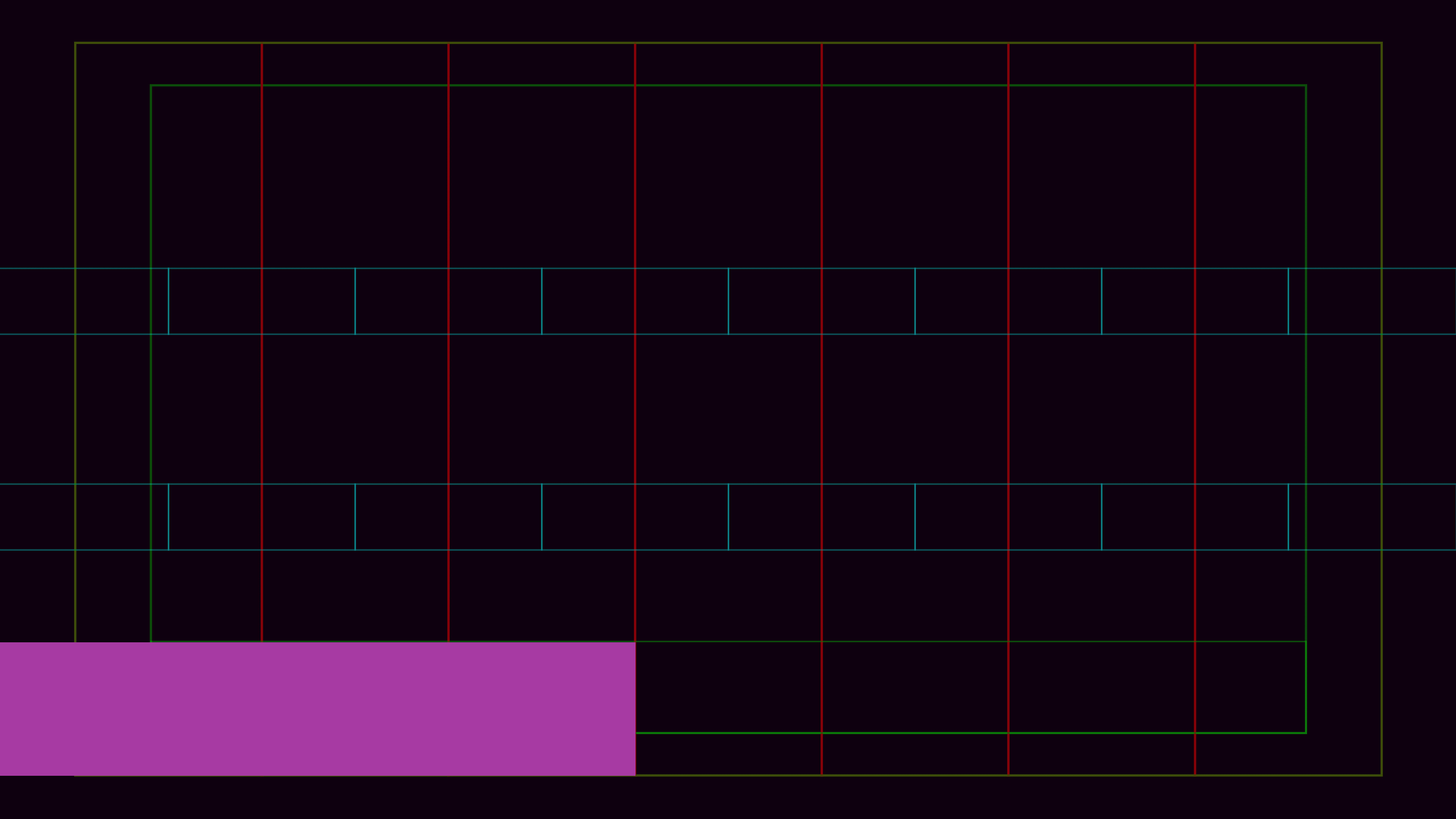
I used glitches, broken signals and broadcast-error screens as a visual reference, then translated that into a grid that could hold the channel’s different on-air elements while still following the practical rules of broadcast design, including safe areas.
The idea of interruption carried naturally into the screen system.
I looked at broadcast-error screens, broken signals and glitch patterns as references- some found online, one I even
photographed during a bus ride- then translated those fragments into a grid that could hold the channel’s different on-air elements while still following the practical rules of broadcast design, including safe areas.
Rather than treating the glitch as a one-off effect, I wanted it to behave like part of the channel itself- showing up in transitions, layouts and even the voiceover, which occasionally stutters or repeats a word or syllable. The result is a system that always feels slightly disrupted, even when everything is technically working.


FROM BRAND TO BROADCAST
The idea of interruption carried naturally into the screen system.
I used glitches, broken signals and broadcast-error screens as a visual reference, then translated that into a grid that could hold the channel’s different on-air elements while still following the practical rules of broadcast design, including safe areas.
The idea of interruption carried naturally into the screen system.
I looked at broadcast-error screens, broken signals and glitch patterns as references- some found online, one I even photographed during a bus ride- then translated those fragments into a grid that could hold the channel’s different on-air elements while still following the practical rules of broadcast design, including safe areas.
Rather than treating the glitch as a one-off effect, I wanted it to behave like part of the channel itself- showing up in transitions, layouts and even the voiceover, which occasionally stutters or repeats a word or syllable. The result is a system that always feels slightly disrupted, even when everything is technically working.
FROM BRAND TO BROADCAST
The idea of interruption carried naturally into the screen system.
I used glitches, broken signals and broadcast-error screens as a visual reference, then translated that into a grid that could hold the channel’s different on-air elements while still following the practical rules of broadcast design, including safe areas.
The idea of interruption carried naturally into the screen system. I looked at broadcast-error screens, broken signals and glitch patterns as references- some found online, one I even photographed during a bus ride- then translated those fragments into a grid that could hold the channel’s different on-air elements while still following the practical rules of broadcast design, including safe areas.
Rather than treating the glitch as a one-off effect, I wanted it to behave like part of the channel itself- showing up in transitions, layouts and even the voiceover, which occasionally stutters or repeats a word or syllable. The result is a system that always feels slightly disrupted, even when everything is technically working.
MOTION & STORYTELLING
Motion was where I could push Dead Air’s personality a little further. Both the logo animation and the creative spot start by doing what horror usually does best- building tension, making something feel threatening and letting you assume you already know where it’s going. The fun part was breaking that expectation before it got too comfortable.
The logo animation turns it into a quick visual gag, while the creative spot takes a familiar chase scene and lets it build all the way to a very dramatic reveal: someone just wanted to return a wallet. Both started as storyboards, with the creative spot later brought to life using Vizcom and Runway for the individual shots, then edited together in Premiere Pro.
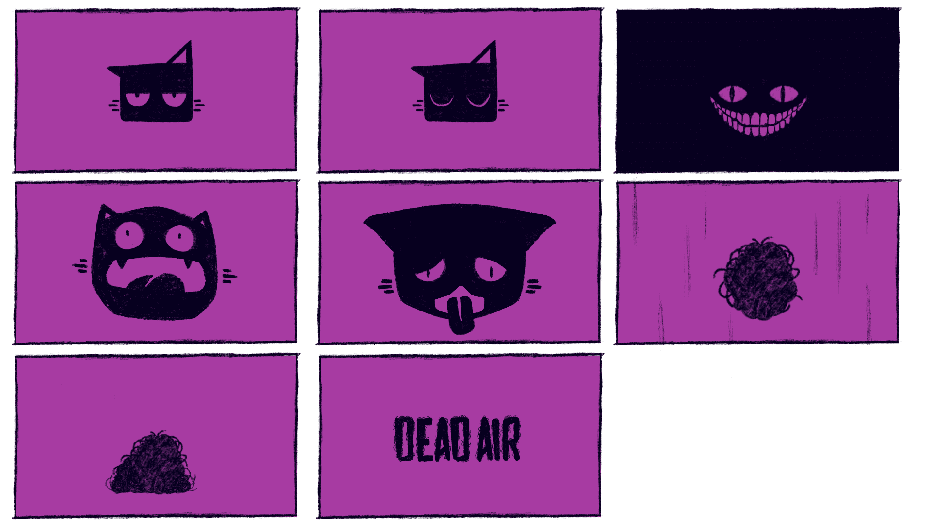
The storyboard was mostly about timing the build-up and seeing how far I could push things before ruining the moment- which, in this case, was kind of the point.

MOTION & STORYTELLING
Motion was where I could push Dead Air’s personality a little further. Both the logo animation and the creative spot start by doing what horror usually does best- building tension, making something feel threatening and letting you assume you already know where it’s going. The fun part was breaking that expectation before it got too comfortable.
The logo animation turns it into a quick visual gag, while the creative spot takes a familiar chase scene and lets it build all the way to a very dramatic reveal: someone just wanted to return a wallet. Both started as storyboards, with the creative spot later brought to life using Vizcom and Runway for the individual shots, then edited together in Premiere Pro.
The storyboard was mostly about timing the build-up and seeing how far I could push things before ruining the moment- which, in this case, was kind of the point.
MOTION & STORYTELLING
Motion was where I could push Dead Air’s personality a little further. Both the logo animation and the creative spot start by doing what horror usually does best- building tension, making something feel threatening and letting you assume you already know where it’s going. The fun part was breaking that expectation before it got too comfortable.
The logo animation turns it into a quick visual gag, while the creative spot takes a familiar chase scene and lets it build all the way to a very dramatic reveal: someone just wanted to return a wallet. Both started as storyboards, with the creative spot later brought to life using Vizcom and Runway for the individual shots, then edited together in Premiere Pro.
The storyboard was mostly about timing the build-up and seeing how far I could push things before ruining the moment- which, in this case, was kind of the point.
STILL SCROLLING?
HIT ME UP WITH A CALL
© Tomer Moalem 2026. All Rights Reserved



STILL SCROLLING?
HIT ME UP WITH A CALL
© Tomer Moalem 2026. All Rights Reserved
STILL SCROLLING?
HIT ME UP WITH A CALL
© Tomer Moalem 2026. All Rights Reserved